You start your day like most people do, with a phone in your hand. You check messages, scroll through social media, and maybe play some music while your laptop boots up. Your browser opens with multiple tabs from yesterday, your favorite series continues preloading in the background, and an AI tool picks up where you left off. Everything feels normal, efficient even. But behind these everyday actions is a system consuming energy around the clock. And while the emissions from our digital habits keep growing, our screens give us no visual indication of the impact.
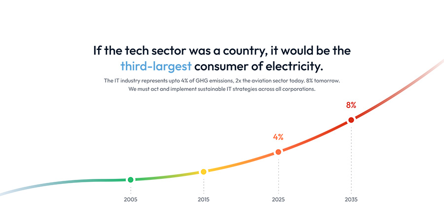
The carbon footprint of the internet is rising rapidly (currently 4% of global greenhouse gas emissions, projected to reach 14% by 2040 if not acted on). However, our digital actions today don’t reflect the state of the grid, nor do they reveal how everyday browsing decisions are made. Our digital interfaces remain oblivious. Autoplaying a video, scrolling through high-resolution images, running unnecessary scripts – all of this contributes to emissions, but offers no signals, no warnings, no awareness.
The core disconnect is this: Users simply don’t know how their digital actions affect the environment because the systems they interact with have never been designed to reveal it. There is no visibility, no feedback, no attunement between our virtual and natural worlds. For all our technical sophistication with AI, the cloud, digital twins, and modern website stacks, the internet has not learned how to relate to the physical world that powers it. As a result, websites don’t reflect the ecological conditions they operate within.
Much of the conversation around sustainable websites has focused on back-end optimization, which includes server efficiency, clean energy procurement, and reduced infrastructure load. Meanwhile, the conversation around the frontend (the user-facing layer) remains nearly invisible.
Optimizations are happening, like the W3C’s draft sustainability guidelines, but these are slow to formalize and sometimes conflict with other business demands. The frontend has been optimized for speed and engagement, at the cost of planetary limits. UX/UI continues to evolve in a vacuum, replicating familiar patterns, unattuned to its environmental cost.

What if it didn’t have to be this way?
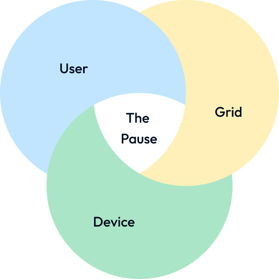
To confront that gap, this essay proposes a new user interface pattern: Pause, for grid-aware websites. A responsive interaction that invites users to break for a moment of awareness. Not a warning. Not a restriction. A designed intermission. A prompt that shows users the real-time impact of their browsing and offers them the option to reduce it.
This sets the stage for a broader shift in design thinking, one that moves beyond efficiency and optimization alone, to attunement: a way of designing interfaces that listen, respond, and respect the constraints of a changing world.
The goal of Pause is to create a shared moment between the user, the device, and the energy grid. It does not aim to make users feel guilty, nor does it force austerity. Instead, it informs the users when the grid is dirty, showing them the real-time impact of their browsing, and offers them the agency to switch to a temporary low-impact mode while the grid is under strain.
It’s a simple gesture to put the user in control of the website experience. Every action becomes an invitation: not to do less, but to do differently. And the user, at last, becomes part of the loop.
Pause is not a new idea
While Pause may feel like a new idea, it draws from a long lineage of design wisdom. Across time, cultures have embedded intentional pauses into rituals, aesthetics, and technologies, not as interruptions, but as spaces of rhythm, meaning, and renewal.
In Japanese aesthetics, the concept of Ma (間) captures this beautifully. Ma refers not to an empty void but to the meaningful interval between things. The silence between notes in music, the space between architectural forms, the breath between spoken thoughts. It’s the pause that gives form its resonance. In a digital context, a grid-aware Pause mode channels this same sensibility. It’s not a deprivation of experience, but the creation of space. Space to feel, to adjust, to harmonize.

Similarly, intermissions in theatre and cinema are another example of designed pauses. These moments serve both practical and psychological functions. A chance for the audience to process, to step away, to ready themselves for what comes next. The experience is not diminished by the intermission; it’s deepened. A pause in a web experience works in much the same way.
We also see this principle echoed in spiritual, religious, and well-being practices across traditions and eras. The Sabbath in Judaism, Sunday rest in Christianity, Friday prayers in Islam, and breathing practices like kumbhaka in yoga or tai chi’s breath-centering rituals all demonstrate a rhythm of intentional pause. These pauses aren’t framed as losses, but as returns: to balance, to self, to system.
Even modern digital detox movements echo this same instinct. People crave disconnection not as an escape, but as a repair. The instinct to pause is not new. What’s new is how rarely the web allows it.
Pause, when integrated into the interface of a grid-aware website, follows this lineage. It’s a cultural, emotional, and infrastructural intervention. It reminds us that not everything needs to be instant, constant, or seamless. Sometimes, it’s the pause that allows an experience to become whole, towards experiences that are not only fast and beautiful, but also attuned, responsive, and responsible.
Designing in an era of constraint: from optimization to attunement
To embed that responsiveness meaningfully, we need to discuss a core idea: attunement. Attunement is not merely efficiency. It’s a design sensibility grounded in responsibility, awareness, and responsiveness. It’s what designers must cultivate when energy systems are variable, when power is not always clean, and when ‘always-on’ can no longer be the default.
Our digital infrastructure is built on the expectation of seamless continuity, uptime, availability, and instant loading. But when ‘always-on’ increasingly means ‘always emitting,’ this expectation becomes unsustainable. What we need are systems that don’t just optimize for speed or scale, but that also know when to adapt, and when to invite the user into that awareness.
This doesn’t mean transferring the full weight of responsibility onto the user. On the contrary, part of attunement is designing sensible defaults, and quiet, sustainable practices that reduce environmental impact without demanding decisions. Principles from sustainable web design offer a practical foundation here:
- Optimized images and videos
- System font stacks
- Lazy loading
- Dark mode
- Reduced animations
- Improved accessibility
… and much more.
These built-in efficiencies don’t just lower energy use. They improve load times and support users on older devices, with slower connections, or in energy-constrained regions. Sustainability does not have to come at the cost of performance, and can in fact open the door to making online experiences accessible to more people.
Such defaults form the baseline of attunement: design choices that care, without asking for attention.
Pause: A UI pattern for the planet
Our experience builds on this foundation by adding a new layer, one of real-time awareness, contextual communication, and shared control. Where defaults silently reduce harm, Pause brings the possibility of responsiveness, transparency, and agency. If thoughtful defaults form the baseline of attunement, Pause extends it, offering users a moment of meaningful interaction in response to changing grid conditions.
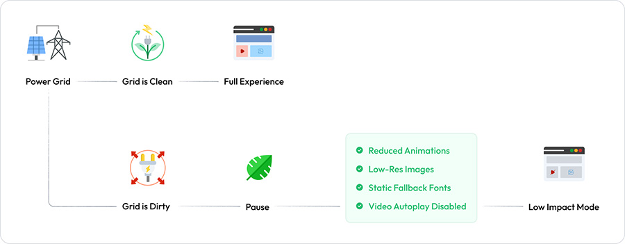
Pause is introduced here as a temporary low-impact mode triggered during periods of high carbon intensity on the electricity grid. However, unlike many existing carbon-aware interfaces, which often impose stripped-down experiences without explanation, Pause is designed to be contextual, communicative, and user-centered.
It’s an intentional act of digital attunement: a small break that restores harmony between browsing behavior and grid reality.
Giving the user control
As our idea matured, one question kept surfacing: What exactly are we asking the user to pause?
Initially, Pause was conceived as a site-wide low-impact mode, a temporary minimization of the digital environment to reduce energy use when the grid was dirtiest. While this was conceptually strong, it risked being too blunt in execution. A universal toggle could remove too much or too little, ignoring what the user values most or what the site needs to function effectively.
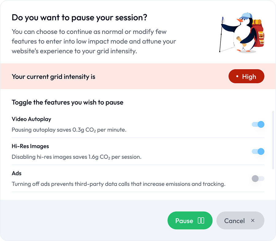
This led to a more granular and responsive approach: a modular Pause mode, where users are presented with a guided interface and the option to selectively suspend individual features based on both their preferences and the relative environmental impact of those features.
Rather than reducing the experience indiscriminately, Pause empowers users to make choices. Depending on the site, whether a streaming service, a media-rich blog, or an ecommerce platform, users could choose to pause:
- Autoplaying video
- High-resolution images
- Third-party advertising
- Animations or transitions
- Embedded media
- External scripts or trackers
Each toggle is accompanied by contextual feedback revealing the real-world impact of their choices. For example:
“Pausing autoplay saves 0.3g CO₂ per minute.”
“Disabling embedded video saves 2.1g CO₂ per session.”
“Turning off ads prevents third-party data calls that increase emissions and tracking.”
Empowering user choice with contextual low-impact controls
This design philosophy aligns with the core principles of user experience: raising awareness through feedback, offering meaningful agency, maintaining usability, and encouraging positive behavior without enforcing austerity. Pause becomes not a disruption, but a collaborative moment of co-design, one in which the user is invited to participate in the performance and footprint of their experience.
Technically, we describe Pause’s characteristics as follows:
- Activation Trigger: Pause activates when the local electricity grid crosses a defined carbon intensity threshold. This is detected in real-time via services such as the Electricity Maps API, which provides location-based grid emissions data.
- User Prompting: The website displays a calm, contextual prompt indicating that the grid is under strain and that a low-impact option is available. The interface doesn’t obstruct or shame, it informs and offers. The user is free to continue as usual or pause.
- Live Feedback via Floaty: A lightweight widget named Floaty tracks the user’s real-time carbon footprint based on their region’s grid intensity and their selected pause options. Floaty updates dynamically as features are paused, giving immediate, tangible feedback:
“You’ve saved 4.2g CO₂ by pausing the video during this session.”
However, if real-time tracking is deemed too heavy for certain implementations, a lightweight alternative model can be used. In this version, emissions data is sampled at the beginning and end of the session, and users receive a summary report:
“You saved approximately 4.6g CO₂ by pausing video, animations, and third-party ads during your session.”
Both models reinforce the same design goals: to make visible digital emissions and energy use, support user agency, and respect implementation constraints. Developers can choose the approach that best balances technical performance with environmental impact.
The way forward
Over time, Pause will evolve further. If a user consistently suspends certain features, the site can gently suggest remembering those settings, creating a personalized low-impact mode that adapts to the user across sessions.
The result is a living, listening interface, one that doesn’t just optimize in silence but attunes. It recognizes both environmental constraints and user values. It invites participation. And it restores a sense of rhythm and care to the digital experience, even in something as small as a pause.
Pause doesn’t have to be limited to a single website or isolated interface. It can become part of the very fabric of the internet. A shared pattern that sets a precedent for energy-aware, user-facing digital experiences.
Imagine Pause embedded at the browser level. The browser itself would detect grid intensity and natively offer a low-impact mode toggle. Sites would adapt content dynamically. Energy-efficient browsing preferences could sync across devices. The result? Browsing becomes context-aware and attuned to our Earth by default; when grids are cleaner, you get the best experience, when grids are under strain, Pause comes into effect.
Pause will transform the web from always-on consumption to intentional, attuned interaction with planetary limits.
Raj Banerjee is a consultant at Antarctica, a global climate technology company advancing sustainable IT. Raj leads research and data science efforts to power Antarctica’s real-time observability platform, providing end-to-end visibility across enterprise IT operations, from cloud infrastructure to AI workflows, employee devices, and business applications. This helps organizations optimize costs, reduce environmental impact, and achieve compliance.
Shraddha Pawar is the lead designer at Antarctica, specializing in UI/UX design for websites, web platforms, and mobile applications. She leads end-to-end design efforts from user research and wireframing to high-fidelity prototyping and design system creation. Shraddha works closely with cross-functional teams to ensure every product is intuitive, visually consistent, and aligned with the brand’s sustainability-driven vision.