 Contents
With approximately 1.5 billion live websites, the internet’s carbon footprint is comparable to that of the global aviation or shipping industry. Since 43% of these sites run on WordPress, even small improvements can have a real impact and help raise awareness about the internet’s effect on the environment.
Websites built with WordPress, and other Content Management Systems (CMSs), draw energy in two ways: Data centers power the server side, and every user’s device consumes energy to render pages. While server hosting can go green, developers are limited in what they can do to control device-side consumption.
Grid-aware WordPress websites would make it possible to reduce energy usage when local electricity grids are running more on fossil fuels, and adjust the experience as the grid becomes cleaner.
Why page weight matters
According to the 2024 HTTP Archive, the average web page size weighs 2,652 KB (2,311 KB on mobile) – and it’s growing.
Images alone account for almost 40% of that, JavaScript about 24%, and fonts 5%. An embedded YouTube video can add more than 1 MB.
A plugin to make WordPress grid-aware
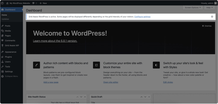
To dynamically adjust these big contributors to page weight, we’ve created a WordPress plugin called Grid Aware WP (currently in alpha) that applies real-time grid power intensity (using data from the Electricity Maps API). It adapts the display of heavy elements, such as images or videos, based on the information available.
The plugin’s main objective is to provide awareness through a tool that informs both users and publishers about the impact of their online activity. It provides standardized options for reducing that impact – both in the backend and the frontend – and paves the way to develop future WordPress websites more sustainably.
To achieve this, the plugin works on two fronts. In the backend, it offers information and management options organized into three sections: a settings page, a cross-platform notification, and elements integrated into the WordPress block editor. In the frontend, it displays a fixed bar at the top of the page that allows users to view information and manage the display.
Additionally, when the grid intensity is medium or high (meaning more fossil-fuel-based energy is being used), it automatically adapts the most demanding elements in terms of consumption – in this case, images, videos, and fonts – and includes additional information so that the user can decide whether to load these elements individually.
The backend: empowering editors and developers
Any plugin that modifies the public appearance of a website has to provide clear and consistent information about what’s happening and why. We therefore designed this plugin to help website owners understand what changes are being made and why, how they affect the frontend, and how they can adjust them.
To keep it simple, we’ve used the native WordPress design system, which, in addition to making the plugin more intuitive and less invasive, reduces incompatibilities and resource consumption.
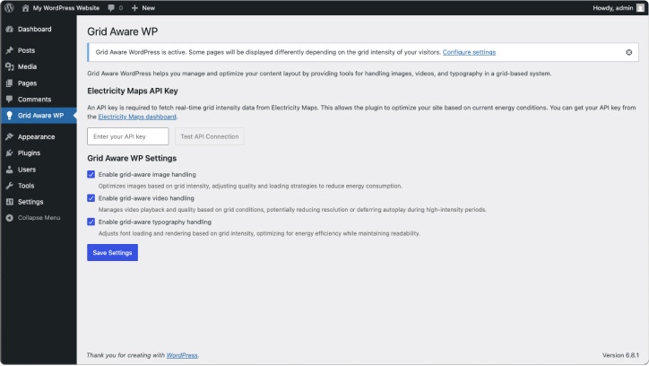
The settings page
Upon installation, the plugin adds a dedicated settings page under the WordPress dashboard, where publishers can define global or per-page behavior. Here, they can decide which elements are critical (and can be shown on the high-intensity version of the site) and which ones can be progressively added to the site as the grid becomes cleaner. This allows them to tailor the system to their project and gives them a greater sense of control.
Block editor controls
The block system, used by modern WordPress, is a modular content editing approach where each element – such as paragraphs, images, headings, buttons, or videos – is treated as an individual ‘block.’ This allows users to build and customize pages and posts visually, using a drag-and-drop interface without needing to write code.
It’s in the website layout that editors can make more informed design decisions regarding the sustainability of their project and understand how the plugin will affect what they’re building. That’s why we’ve opted to add specific options and useful information to three editing areas: to the preview links, the sidebar, and some blocks.
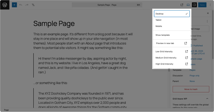
Preview links
Previewing different versions of a page allows the editor to check what they would look like in real time, without having to leave the workspace. WordPress allows users to add preview options that integrate seamlessly with the predefined ones. This means, the editor doesn’t have to learn how to access the views beforehand.
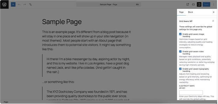
Side panel and blocks
When editors are still familiarizing themselves with grid-aware design, it’s helpful to have this information visible alongside the layout options. This way, as they build the page and include elements that could be affected – such as images or videos – they have reminders in the blocks and in the side panel to help them make design decisions that take grid-awareness into account.
Additionally, we’ve included the option to override general settings on pages or posts. This way, editors don’t have to disable modifications to an element across the entire website if they only need them to occur in specific sections. This is especially useful for keeping key pages like the checkout or promotional landing pages intact.
Admin banner
We believe that a publisher should always be aware when a portion of their audience may be seeing a different design than the original, as this can significantly impact the user experience, conversions, or the way information is received. That’s why we’ve decided to include a visible warning message on all pages of the admin panel – alerting the site owner or developer that visitors on a fossil-fuel-heavy grid will see a modified experience.
The frontend: informing and engaging site visitors
The interface the end user sees is often the most complex and delicate part of a website, as each project and user profile presents needs and objectives that are difficult to standardize. However, there is a general principle that can be applied: A well-informed user with options is usually a satisfied user.
Drawing inspiration from Branch, we have adapted it to the WordPress ecosystem, balancing the user experience with education about the impact of their visit to a website.
The top bar
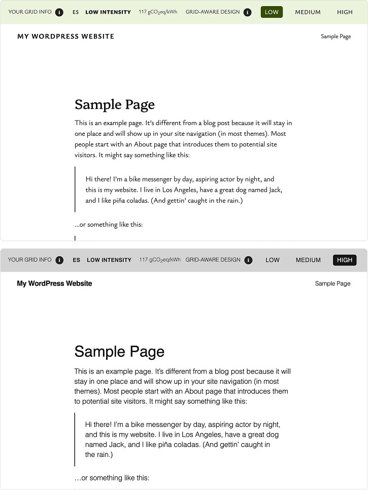
This element is always visible. It provides the end user with information about the grid-aware system and offers options to explore the different views. By default, it reflects real-time data for the user’s location.
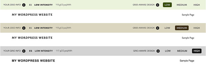
For consistency, we’ve kept the ‘Low,’ ‘Medium,’ and ‘High’ labels in the view selector. However, we believe they can potentially be confusing: Since the buttons change the layout, the user might interpret ‘Low’ as offering a simpler design, when in fact it refers to a low-intensity power grid.
As part of the Grid-aware Websites project, there is also work underway to create a generic grid-aware information bar web component. Similar to the top bar, the aim of this web component is to provide information to the user about their current grid, while allowing them the control to change their grid-aware experience if they wish. The web component is designed to be used on any grid-aware website, not just WordPress sites. It’s something we might look to add to this project at a later time.

Graphical elements
This is probably the part that requires the most testing, as it directly impacts both the user experience and their goals when visiting the website, as well as the site owner’s conversion goals.
Embedded images and videos
For the display of both videos and images based on grid intensity, we were inspired by the system used by Branch.
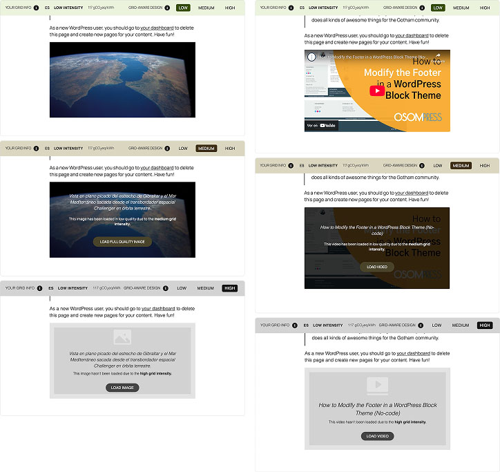
With low grid intensity, images and videos load exactly as they were added in the editor.
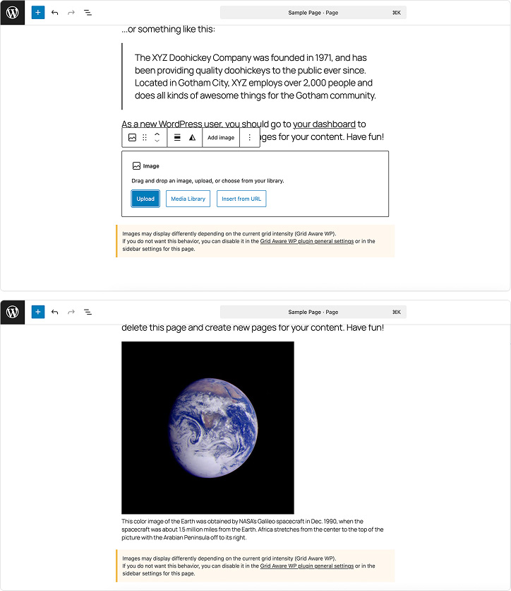
Under moderate grid intensity, the presentation of images and videos changes slightly:
- Images: A smaller, slightly blurred version is displayed. The alt text, an explanatory message, and a button to load the original image, appear above it.
- Videos: Instead of the embedded video, only the cover art loads. Hovering over it reveals the video title, an explanatory message, and a button to load the full video.
With high grid intensity, neither images nor videos load by default. Instead, a placeholder with informative text and a button to load the content is displayed, along with alt text for images and a title for videos.
Typography
To reduce energy consumption from fonts, the simplest and most effective option is to replace custom fonts with system fonts. While this measure may be feasible for many websites – those with a more practical and informative focus and a less aesthetic one – we recognize that it’s an invasive modification. Therefore, we have limited it to high grid-intensity situations only.
A less drastic alternative could be the use of Modern Font Stacks, which allows for reduced resources without compromising on the original design. We are planning to explore this option more in the future.
Acknowledgments
The collaboration with Electricity Maps, which created a new endpoint in its API, allowed us a better use of their API. We think this is a good example of the positive impact of this type of project. We also take this opportunity to thank the Green Web Foundation and the Electricity Maps team for their willingness to collaborate.
Although the Grid-aware Websites project uses edge workers as a cornerstone, when creating a WordPress plugin, we found that it added an extra layer of complexity by relying on a CDN (content delivery network), obtaining an API key, and having to add it to the plugin settings. However, using WordPress filters to make changes at the server level can simplify the plugins’ use while maintaining the essence of the project. This has been the path we have chosen so far, although we are open to other suggestions.
Creating a WordPress plugin that works for both the diversity of websites and non-technical users meant initially prioritizing education: preview modes, clear labels, and granular control over how the website will look. We also limited some changes to websites that use the latest CMS features, as they are more standardized and allow for secure modifications.
Join our open-source effort
While our proposal is far from a definitive solution to the problem of resource overuse on the web, we believe it can contribute to a much-needed reflection: more people – visitors, editors, designers, and developers – will ask themselves, “What is the impact of what I’m uploading?”.
Following the open-source philosophy that has made the WordPress CMS what it is today, we invite those committed to creating more sustainable WordPress sites to contribute improvements that will make this project a useful tool for moving us closer to a more climate-conscious internet.
The code for this plugin can be found on GitHub. The project is open source, and we welcome community contributions. If you have any ideas, you can let us know by either raising a GitHub issue or contact us via our social media handles below. We eventually aim to publish this plugin to the official WordPress repository as well.
Nora Ferreirós is a UX/UI designer whose approach is driven by the impact of her work on people and the planet. She advocates for environmental sustainability and other ethical practices in tech while actively contributing to open-source projects.
Nahuai Badiola is a freelance WordPress developer, theme and plugin creator, who writes WordPress code tutorials, and enjoys sharing everything he learns about web sustainability on his blog, in his podcast, and at various WP events.