 Contents
Branch launched five years ago, and if you’ve been following along, you may have noticed that issue 9 arrives with a fresh site redesign. This new design builds on valuable feedback we’ve received from you, our community, and some brand-new ideas we’ve been exploring as part of the Green Web Foundation’s Grid-aware Websites project.
Digital should feel physical
Branch‘s initial design set out to creatively explore how we could link a digital experience to the realities of the physical world. We experimented with reflecting the fossil-fuel powered pieces of the physical infrastructure of the internet and introduced Sustainable Interaction Design Principles in Branch’s inaugural issue.
Fast forward to 2025 and the new era of AI-driven everything. Rapidly expanding data centers and computation demands are hammering finite resources like fossil fuels, water, land, and minerals at an unprecendented rate. But still, many users and advocates for these technologies don’t recognize these harms.
We believe it’s more urgent than ever to help users understand the digital world in the physical realities of what’s actually happening.
One of the practices we’re moved to embrace for super-charging this perception is grid-aware.
What is grid-aware?
Grid-aware is the idea of making something digital detect the electricity grid around it, and depending on what’s happening, adjust that digital thing’s behavior to have a beneficial impact rather than a negative one.
These adjustments can be responding to the carbon emissions arising from the electricity grid at a moment in time, or to other grid factors such as demand peaks and resilience needs. The idea is to holistically consider the electricity grid that digital thing is operating within, and look for opportunities where it can help, rather than harm, that grid. This holistic view is vital to avoid a carbon tunnel vision problem.
For this Branch redesign, we riffed on this wider grid-aware concept to develop an experimental practice for websites to attune to the grid around it. Our aim has been to create a deeper connection to the physical resource use behind a digital experience in the user’s mind. We also wanted to show this approach doesn’t have to mean drastically sacrificing the design or user experience.
How a grid-aware website works
- Work out the rough geographical location of a user.
- Find out how clean or dirty the user’s local electricity grid is.
- Alter the site’s behavior to different modes to represent this.
In our implementation, some modes have a happy by-product of lowering the energy demand on a user’s device. This can make the site more accessible to people on slower internet connections or lower-spec / older devices too.
Surfacing the grid status
Key to creating this user awareness is the grid-aware status bar that sits on top of the site. Its core feature is to connect the user’s location to the electricity grid powering their device, and indicating how clean or fossil-fuel-heavy that energy is.

This live indicator, and the overall grid-aware design implementation on Branch, is powered by an open-source toolkit which provides a web component you can drop into your site. Behind the scenes, this component uses an API from data provider Electricity Maps. This API provides a high, moderate, or low signal reflecting the current carbon intensity of a location’s energy grid compared to a rolling 10-day average.
The high, moderate, and low status is determined by the following thresholds:
- Low: 15% below average (ratio < 0.85)
- Moderate: between 15% below and 15% above average (0.85 ≤ ratio ≤ 1.15)
- High: 15% above average (ratio > 1.15)
More information about the Carbon Intensity Level API can be found on the Electricity Maps website.
Four dynamic design states
Branch adapts in real time to the carbon footprint of the user’s local energy grid. Whenever you visit, you’ll experience one of four distinct design states:
- Default mode
- Cleaner than average – low intensity mode
- Near average emissions – moderate intensity mode
- Dirtier than average – high intensity mode
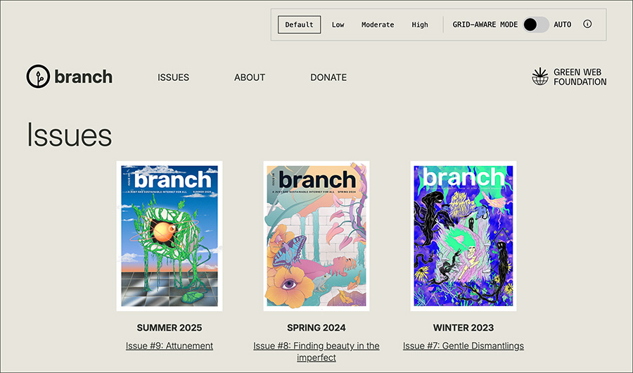
1. Default mode
When first arriving at the site, the user is presented with the default state. This means you’re seeing the site in its natural state with no changes. The background shifts to grey, and images and videos are automatically shown. The user can opt-in to see the site in grid-aware mode through using the options at the top, and more user-choice below. This view is also used when carbon data can’t be fetched – whether due to API outages, connectivity issues, or other technical hiccups. It reminds us that our digital experiences rely on technology and physical infrastructure, which can and does fail.
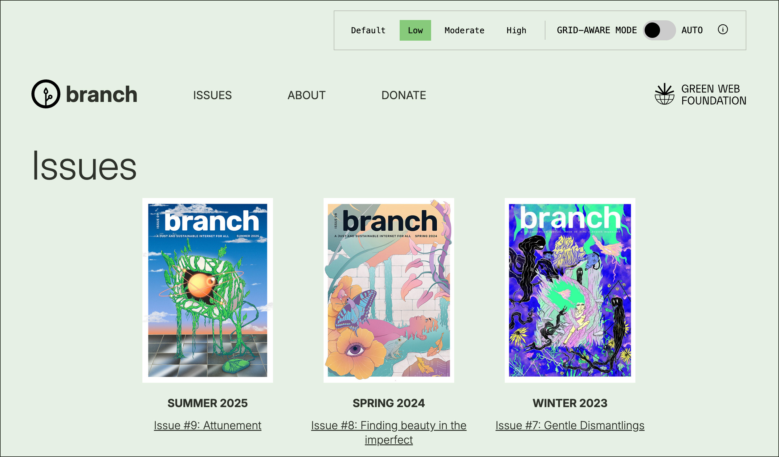
2. Cleaner than average – low intensity mode
When the user’s grid has a higher share of renewable energy and fewer fossil fuels than average, the site turns green and delivers the full experience with all images, videos and media loaded by default. We also load a custom font, Inter.
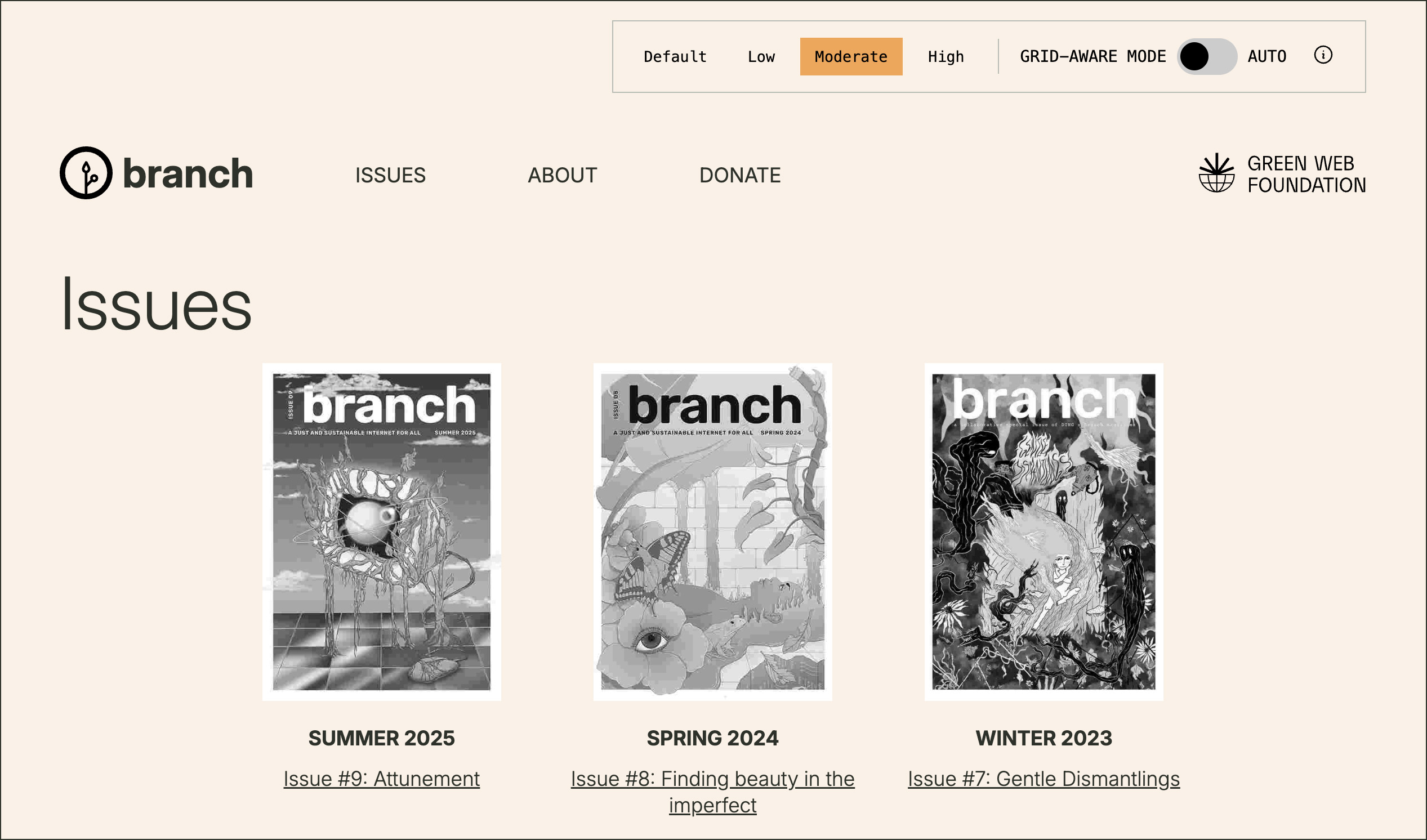
3. Near average emissions – moderate intensity mode
If the user’s local grid emissions are around average, the site switches to an orange background and displays compressed, lighter versions of images and videos.
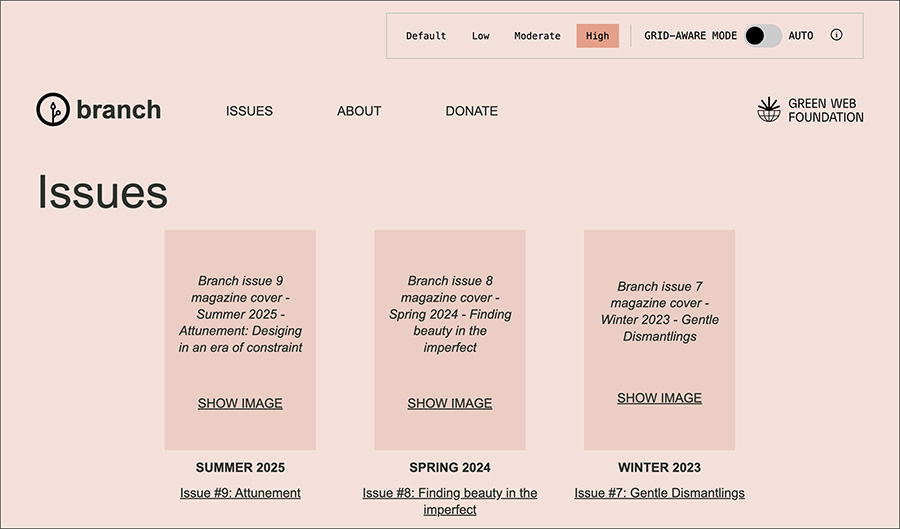
4. Dirtier than average – high intensity mode
When the local grid relies more heavily on fossil fuels, the background turns red and we reverse the way media is shown. Instead of automatically loading media, we emphasize descriptive alt text, giving users the option to click to reveal images or videos. This approach encourages writing more meaningful alt texts and uses system fonts to further reduce energy demands.
Enabling user choice
When a person visits Branch for the first time, they will see the default view described above. This means that rather than being applied automatically, we allow users to opt-in to applying grid-aware changes to the website. To enable this, we have included a ‘Grid-aware mode’ toggle in the status bar at the top of the site. This is a nod to the now common dark mode switches you see on other sites.

A person visiting Branch for the first time will see the ‘Grid-aware mode’ toggle set to an off position. Next to that, they will be presented with buttons allowing them to select the different views – low, moderate, and high – depicted in the image above. This allows users to manually select a mode to view the website in, or they can alternately continue to view the site in the default mode.
By switching the ‘Grid-aware mode’ toggle into the ‘auto’ position, users can also opt-in to having a grid-aware design automatically applied to the site as they browse. In this state, we use a Cloudflare Worker running code from our Grid-aware Websites project to make modifications to the website HTML before the page is returned to a user’s browser. The changes that are made are based on the current grid intensity of the user’s local energy grid, based on data that is provided by the Electricity Maps API we touched on earlier. The code that does all that can be found on GitHub.
Although Branch is a WordPress website, our grid-aware status bar is a standalone web component that can be used on any site. Explore the project code and usage guides on GitHub as part of the open-source Grid-aware Websites toolkit, or install via the Grid-aware Websites Cloudflare Workers plugin, which requires a single configuration option.
Other design adjustments
Beyond its grid responsiveness, the Branch site has also been designed to consume as little energy as possible by reducing image weight, minimizing JavaScript, refreshing the color palettes, and utilizing system fonts during high-carbon periods.
Some Branch articles include embedded content like YouTube videos and PDFs. In these cases, we have taken steps to reduce the size of these embeds where possible. For YouTube videos, we replace the regular YouTube embed with a Lite YouTube Embed web component in the cleaner than average and near average views. This presents a static image and play icon, and only downloads content from YouTube (without cookies) when the user interacts with the video element. During high-carbon periods, the YouTube element is replaced with a placeholder similar to that used for images on the website which guides the user to watching the video on YouTube if they wish to do so.
Meanwhile, for embedded PDF content, we use a WordPress plugin to display PDFs in an article in the cleaner than average and near average views. A link to download the PDF is also included below the embed for users who wish to view to the content at a later time. During high-carbon periods, the PDF embed is removed from the article entirely, with only the link to download the PDF remaining in place for the user.
Continuing the conversation
We hope this redesign sparks greater awareness of sustainable digital design and inspires new ideas and experiments that prove we can provide a good user experience, while accounting for the internet’s physical impact. If it has we’d love to hear from you. Here’s a few routes to continue the conversation with us:
For ideas about how to improve the design or technical implementation you see here on the Branch website, please raise an issue for us in our Branch theme GitHub repository which is hosted on ClimateAction.tech’s github account.
If you’re having a go at using any of the Grid-aware Websites toolkit in any of your own projects – kudos by the way – and have suggestions or would like to share your implementation, please do so by raising a GitHub issue in the relevant repo. Most likely you will be using the Grid-aware Websites library. If in doubt, there’s always our Green Web Foundation support form.
All our work is open-source and free to use. Please consider giving us the highest form of compliment, a donation, so we can keep this work up to date and relevant. Our Open Collective page is perfect for private donations, or you can drop us a line through our Green Web Foundation support form for private donations and grant enquiries. Thank you.
Fershad Irani is a web sustainability consultant living in Taipei, Taiwan. He works with Green Web Foundation across a range of areas, particularly turning sustainable web ideas into working prototypes and code libraries. He specialises in carbon emissions calculations, and is the lead maintainer of the CO2.js library as well as the Grid-aware Websites project.
Tom Jarrett is a designer exploring sustainable interaction design who designs digital products and services to work within ecological limits.
Hannah Smith is Director of Operations for Green Web Foundation, and puts a strong emphasis on fostering a joyful and effective delivery culture. She provides technical and operational leadership on the GWF’s open source tool suite including the Green Web Directory, Branch magazine, and Grid-Aware Websites. Outside GWF, she’s co-founder of the Green Tech South West community and a long-term volunteer with ClimateAction.tech. She lives in the temperate rainforest in Exmoor National Park, UK.