? Grid intensity view:

Issue 1

Issue 2

Issue 3

Issue 4

Issue 5

Issue 6

Issue 7

Issue 8

Unknown grid intensity

From bytes to carbon savings: Immediate’s sustainable transformation of Good Food

In an era where everything is digital, the environmental impact of websites often goes unnoticed. However, for the team at Immediate, digital sustainability has become a central focus in their web design and development process. Recently, they embarked on a journey to understand and mitigate the carbon footprint of the biggest website in their portfolio, Good Food.

Wholegrain Digital’s Technical Lead, Tommy Ferry, and Digital Sustainability Lead, Marketa Benisek, sat down with Michelle Whitehead, Sustainability Lead at Immediate , Linzi Ricketts, Senior Product Manager and Filippa Furniss, Product Manager, and Graham Martin, Solutions Architect, to delve into their  perceptions of sustainable web design, their experiences implementing changes following Wholegrain’s a Sustainable Web Design Masterclass, and their ongoing efforts to reduce environmental impact while maintaining an engaging online presence.

Join us as we uncover the value of sustainability-first design thinking in the digital landscape.
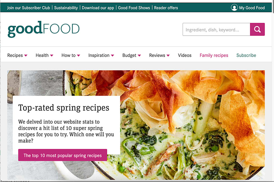
BBC Good Food homepage screenshot
A screenshot of the BBC Good Food homepage, provided by Immediate

Embarking on the digital sustainability journey

Firstly, let’s talk about your experiences and insights regarding the journey toward creating a more sustainable website for Good Food. Before the Sustainable Web Design Masterclass, how did you and your team perceive the concept of sustainable web design? Were sustainability considerations already part of your development and design process? If so, could you name some?

“Sustainability is definitely a topic we thought about within our processes prior to the Masterclass, but we weren’t 100% certain on what areas we could have a positive impact on as a tech department. There were lots we were already doing, especially when considering different technologies and services, however there was never anyone championing it within the department. We wanted to change that, which is why we set out creating a Product and Tech sustainability working group, looking at not only what we currently do, but what more we could do towards sustainability in tech.”

What were your initial reactions when presented with the findings from the website carbon audit? Were there any surprises or concerns that stood out to you?

“It was very interesting to hear the effect the site was having in terms of annual energy consumption and annual carbon emissions. It was really interesting to understand this visually, which meant we had a better sense of the size and impact our sites were having.”

Can you share some insights into the process of implementing the changes recommended in the Masterclass to make the Good Food website more sustainable? Were there any challenges or unexpected obstacles you encountered along the way?

“We went through all the recommendations with our Solutions Architect and stack ranked them based on estimated effort and performance benefit, alongside other changes  that we wanted to make. One of the key challenges was ensuring buy-in from the leadership team and the wider business as to why prioritising sustainability work was important. We found emphasising the benefits of performance improvements from both a sustainability perspective and a revenue perspective really helped get people on board.”

From your experience with the Sustainable Web Design Masterclass and the subsequent changes made to the website, what would you say is the most valuable lesson you and your team have learned about integrating sustainability into web design and development practices?

“The Masterclass helped us to visualise everything. It made it very clear how much integrating sustainability into our processes could help reduce emissions and energy use, even from the most simple changes. A big take away   was that we should include sustainability considerations from the beginning of any project, to save us time and effort  revisiting previous work to make improvements. Seeing the results from the first change has encouraged us to continue to push for more ambitious sustainability targets.”

CO2 savings

Given the sheer scale of the Good Food website, with tens of thousands of URLs, Immediate made a strategic decision to focus their efforts on auditing the first 30,000 URLs, which represent the majority of site traffic. After Immediate  made some changes to the Good Food website, the team at Wholegrain Digital analysed data from approximately 3,000 URLs, which cover approximately 75% of page views, to find out how much data and carbon emissions were saved as a result of these changes. The results were fascinating. 

The calculations revealed that the optimisations could have led to a remarkable reduction in page sizes, approximately 766 MB in total. This reduction then translates to an estimated annual data transfer reduction of a staggering 197,147 GB, resulting in approximately 29,063 kg of CO2 emissions saved on a standard grid.

These numbers highlight the significant impact of sustainability-focused web design efforts. It also serves as a testament to the power of collaboration and innovation in driving positive change. As we continue to navigate the complexities of digital sustainability, initiatives like this set a great example for the industry, inspiring others to follow in their pursuit of a more sustainable future.
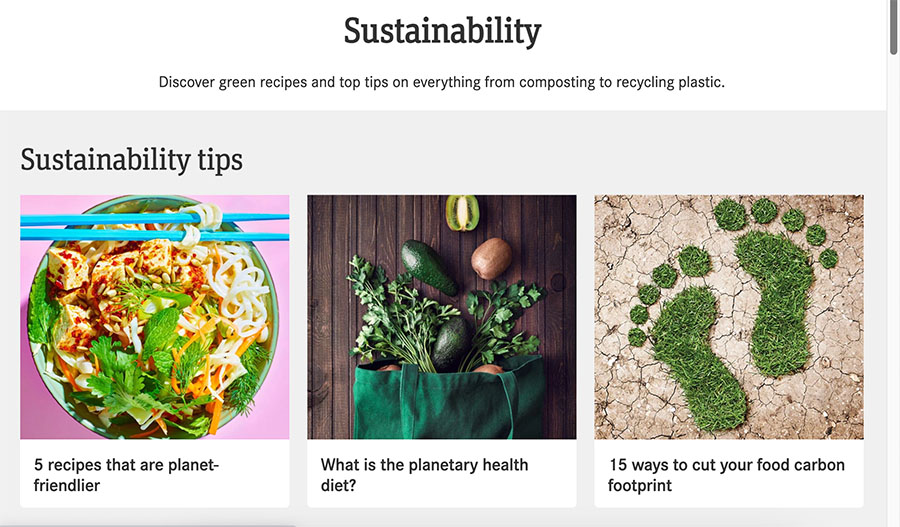
Sustainability recipes - BBC Good Food screenshot
A screenshot of sustainability tips on the Good Food website, provided by Immediate

It’s fascinating to learn about the estimated carbon savings resulting from the video optimisations made to the  Good Food website (approximately 29,063 kg of CO2e with more changes to come later this year!). Can you walk us through the changes implemented by your team so far to achieve these reductions in page size and data transfer?

“One of the key  changes we have implemented so far is around video facades. Previously we would automatically load video embeds, and we have a lot of content on our site that includes video so this was adding huge weight to the page. We now display an image as a video thumbnail, then once clicked on by the user,  the video then loads.”

Were there any aspects of the sustainability-focused changes that you or your team found particularly challenging or imperfect? How did you navigate through these challenges?

“One of the challenges is that we have a huge amount of legacy content going back decades, which is incredibly difficult to improve at scale. Due to the nature of our website and how much is written every day by our content creators, a key aim is to thoroughly educate our editors on best practice around things like image formatting, limiting the number of unnecessary images , and length of content. This will ensure that as we produce new content, we’re adhering to sustainable best practice.”

How have you found balancing business objectives against sustainability? Have they worked well together or has your team had to make any trade-offs?

“We recently introduced a sustainability section to any work submitted for development, so we can understand the sustainability benefit or risk on each business objective. As mentioned previously, the challenge is balancing sustainability improvements with potential revenue impacts. However, we’ve found there is often a happy medium, where improved sustainability often leads to higher performance. This can be translated to faster page load, or a shorter time to first ad, which all contribute to an increase in revenue. We’ve found that emphasising these points with the wider business means we are more likely to get the leadership support required to get our proposals onto our roadmap.”

Reflecting on the changes made to reduce the website’s carbon footprint, do you feel that the effort was worth it? Have you noticed any significant improvements in sustainability metrics since implementing these changes?

“Using our performance monitoring tools, we’ve been able to track real-world improvements following our sustainability improvements. We’ve worked to reduce some of the JavaScript required on our web pages including using video facades to ensure we only load this JavaScript when it’s needed. This helps to reduce the volume of data we need to transfer for each user and reduces the processor and battery power required to run pages on a user’s device. Since launching video facades we’ve seen improvements of up to 25% to Interaction to Next Paint (INP), one of Google’s Core Web Vital metrics that is heavily influenced by the amount of JavaScript running on a page. This also helps to drive improvements to key metrics like search engine ranking and our ad speeds, helping to demonstrate the business value in delivering sustainability improvements.”

As you continue to explore ways to further reduce the environmental impact of the Good Food website, what areas do you see as having the most potential for additional improvements? Are there any new technologies or approaches you’re considering integrating into your sustainability efforts?

“We’ll endeavour to continue monitoring our sustainability, working towards implementing all the relevant changes and improvements outlined in the masterclass feedback whilst continuing to explore further improvements we can make. 

A site like Good Food is always evolving and is operating at a scale where seemingly small improvements can ultimately lead to significant reductions in our environmental footprint. We’ll be continuing to embed a sustainability perspective into our workflows to ensure we are always seeking these opportunities. Some of our biggest step-changes are likely to come from personalisation and intelligent decision making with an aim of optimising our pages for individual users showing them more focused, relevant content, functionality and advertising enabling us to reduce the overall size of our pages.”

Looking ahead, do you foresee any challenges or opportunities in maintaining these sustainability gains as the Good Food website continues to evolve and grow? How do you plan to sustain and build upon these achievements in the long term?

What started as an interest in how we could try to make our sites more sustainable has in the last six months evolved into a well-established Product and Tech Sustainability working group. Members of this group represent the department in the wider business sustainability panel, known as the Changemakers. There we work together with representatives from across the entire business to champion sustainable practices, educate our colleagues on changes they can make both at work and at home, and organise events to promote climate action.


About Immediate 

Immediate is committed to being a sustainable media company by reducing the impact we have on the environment and helping to drive understanding and change through the content we create. Our goal is clear: by 2030, we aim to cut greenhouse gas emissions from our business and supply chain by 30%, working towards achieving net zero by 2045. Over the last couple of years we have been working hard to reduce the emissions of our supply chain. It is clear that as our business grows its digital output, we need to be mindful of our digital emissions, so working with Wholegrain Digital has been incredibly insightful. The audit of the Good Food Website and accompanying masterclass was a really galvanising piece of work that brought the product and tech teams and digital content creators together and helped to give them a clear plan of action to ensure that our websites are as sustainable as they can be. 

Embracing friction: A conversation with Luna Maurer and Roel Wouters

In an era where seamless experiences dominate the digital landscape, Luna Maurer and Roel Wouters, the visionary minds behind theDesigning Friction project, challenge the status quo. This project reimagines the role of friction in digital culture, advocating for its intentional integration into design principles. With a burning desire to revive human connection and engagement, Luna and Roel have set out on a mission to disrupt the prevailing narrative of convenience at any cost.

Designing Friction’ stands as a call to action for designers, entrepreneurs and architects of digital culture to rethink their approach. Luna and Roel uncover the essence of friction, highlighting its importance as a catalyst for meaningful interactions. From discomfort to time delay, they explore various angles of friction and how these elements can enrich user experiences in the digital realm.

In this exclusive interview, Luna and Roel share their insights, inspirations and aspirations for a future where friction is not only accepted but encouraged and celebrated. Could their visionary perspective on designing friction transform the digital landscape and revolutionise how we interact with technology to create deeper connections and more meaningful experiences in our increasingly digital world?


Designing with friction

Can you share with us a quick summary of ‘Designing Friction’? What sparked your interest in exploring digital culture from a critical perspective, and how has this interest evolved over time?

“For a long time, we have been working with digital media, mostly creating works in the cultural digital domain and reflecting on the social effects of digital technology and the complex interaction between humans and machines. This has resulted in various works, ranging from performances and films, often digital and participatory with an audience. We started in the years 2000 as absolute tech-optimists that embrace the possibilities the web gives us, such as collaborating with people from different locations and cultures from around the world.

Twelve years ago, we formulated a methodology that we called ‘Conditional Design‘. In this advancing era of digitization, we wanted to emphasize the emergence of processes rather than ‘fixed’ designs. We achieved this by developing precise conditions and frameworks, with carefully formulated rules and instructions.

Conditional Design and the years that followed had an important focus: to explore and emphasize humanity in our increasingly digital lives. By imposing limitations on people through algorithms, we discovered that we could play with their behaviour and distil their human strength.

However, now the open web changed radically. The space for playful web experiments hardly exists anymore. We have shifted to a digital culture that is driven by an influencer economy, controlled by big tech and AI. The web has changed from a platform, a public space, to an infrastructure for big tech platforms. With its users locked in the ‘safe’ environment of the dominant platforms. Designing Friction –  a call for friction in digital culture – explores the concept of consciously reintroducing obstacles and resistance in our online interactions to foster human connections. It can be seen as a new design paradigm not focussing on seamless experiences but on human connection. What does it mean to be human?”

Other than observing the radical shift of the web away from empowering humans and toward restricting how they can interact with and use it, were there any other reasons that motivated you to advocate for designing with friction in a culture that often prioritises convenience and seamlessness?

“Another inspiration is our own families and children: while our children are growing up, we constantly have to question: what (digital) products, what behaviour do we want to teach them, what do we want them to learn? This has led to many frustrating experiences, needless to say that the convenient, screen-based (home-)entertainment industry changes the behaviour of our children, and with that their motivation to go outside and play for example. We experience that they are much happier after having connected with others physically or have gone outside and experience the world off-screen. But actually, this applies not only to our children but also to adults. Besides that, we have lost boredom. The perfect condition for initiatives of all sorts.”

Could you elaborate on the challenges posed by the loss of friction in contemporary digital technology, and what implications this loss might have for users and society?

“There are many implications. One is, for example, movement. We move less. We can organize our whole lives behind the screen, there is hardly any necessity to move at all.  In order to move, we go to the gym. And there, people watch screens again :). We say provocatively: ‘death by convenience’.

Another implication is that everything that brings comfort, ease and efficiency with digital tools or apps, for example, with AI is another step further to our dependency on Big Tech. As we wrote in ‘Designing Friction’: “Our autonomy is at stake.”

There are many more implications, but ultimately we guess our humanness as we perceive it is at stake. Technology’s aim is optimising, and so it goes with our human flaws and imperfections.

It is tricky, we are not advocating to enjoy pain. But we totally believe in the value that (also physical) effort brings. That things are not happening by themselves, that things are complicated. We believe in the value of care and in taking the time to slow down, and perhaps in doing less or less efficiently, rather than striving for more.”

In what ways do you believe our reliance on convenience-driven technology may be impacting our ability to engage meaningfully with each other and our environment?

“There are a lot of examples of how our convenience-driven technology impacts our interactions. One example is chat, or text messages. Using WhatsApp has tremendously influenced how we interact and communicate with each other. One thing for sure is that with texting it is very hard to understand exactly the intentions, we need many emojis or several texts to make sure it is understood right. Calling someone these days has become an act of intimacy. The sound of a voice contains way more information than the same words in a written format. You hear right away what’s up. You need less words, there is less miscommunication, it is more precise and deeper, more honest.”

Speaking of emojis, you also worked on a project called ‘Emoji is all we have’. Could you provide insights into the inspiration behind this project?

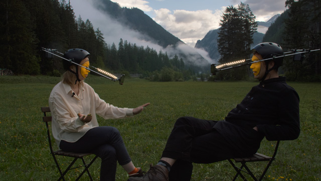
Film creators Luna Maurer and Roel Wouters on chairs in Swiss mountains
Still from ‘Emoji is all we have’, a film by Luna Maurer & Roel Wouters, 2023 (CC BY-NC 4.0)

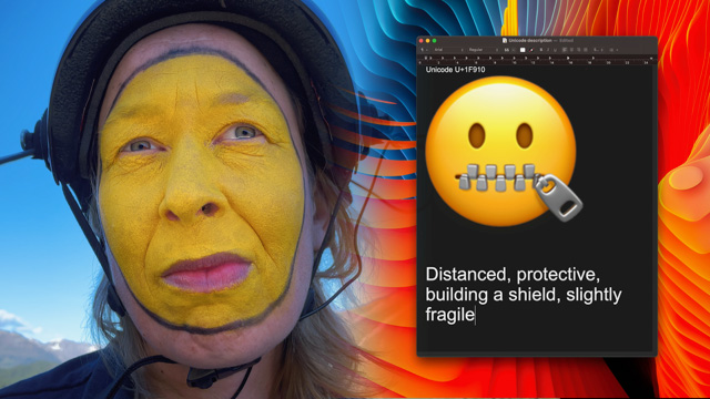
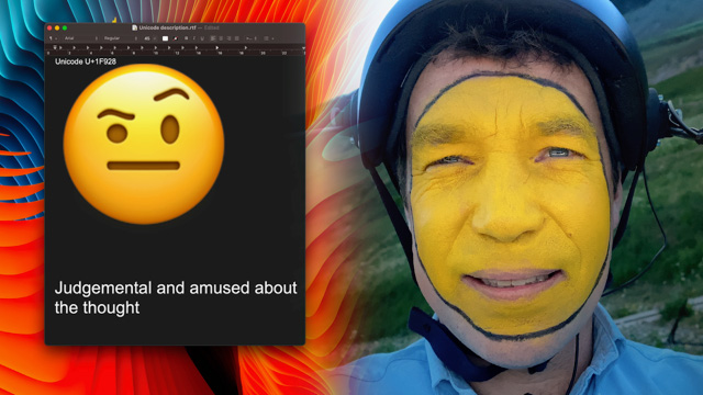
“We decided to make a film series from conversations between the two of us about our perspective on digital technology while having emoticon makeup. These conversations in the Swiss mountains turned out to be very honest and fragile. In our emoji-face the film series Emoji is all we have depicts the contrast between the emoticons and real emotions with the complexity and subtlety of real life that digital technology cannot reach. Our vision on digital technology is also discussed in the film: Digital technology that tries to even out all wrinkles of human encounters, with the premise of frictionless interactions.” 

Currently the film series is on show at Nieuwe Instituut, REBOOT: Pioneering Digital Art, Rotterdam until 12 May 2024.

The use of emojis as simplified representations of complex emotions is a central theme in the film series. Can you discuss the significance of emojis in contemporary communication and how, in your view, they influence our understanding and expression of emotions?

“Our central question we pose here is: Do emojis have the potential to be full representations of our emotions or is digitisation dragging us into an increasingly rational, optimised world? 

Of course emojis are very helpful tools to give a text a more complex message. However, we wonder, do our emotions (and behaviour in general) adapt to the digital tools we have at our fingertips?”

Woman's face painted yellow next to zipper mouth emoji icon
Still from ‘Emoji is all we have’, a film by Luna Maurer & Roel Wouters, 2023 (CC BY-NC 4.0)
Judgemental emoji icon next to face of man painted yellow
Still from ‘Emoji is all we have’, a film by Luna Maurer & Roel Wouters, 2023 (CC BY-NC 4.0)

In ‘Designing Friction’, you also referred to the work of philosopher Miriam Rasch who shared her work on Listening. In her own words: “Perhaps listening can be a small form of resistance against the domination of algorithms, fake news, and troll factories.” How do you suggest friction could help us get better at listening to each other?

“The concept of listening by Miriam is wonderful. Listening can be an act of resistance. Especially since digital platforms constantly lure us into taking positions. Polls, Post, Like and Follow, all designed to trigger a quickly formulated reaction often not nuanced or layered.  We should not be afraid to listen. Listening means acknowledging friction: listening belongs to the concept of the ‘non-positive’, it is not being negative, it’s just postponing your reaction in favour of nuance and layering, to not be afraid of ‘the other’.”

Can you discuss any specific experiences or projects that helped solidify your belief that imperfection and friction are essential components of humane design?

“A few months ago, a friend of ours started a bakery in an old dance school. The architecture of the dance school was not directly inline with the requirements of a bakery. As a result the waiting line was blocking the access to the coffee tables. People constantly had to excuse themselves and interact with each other. The bakery was hailed for its fantastic vibe (and bread). And when our friend announced to move to a new construction, customers were a bit sentimental and afraid the new construction would never be able to have the same vibe.

Our friend realized the good vibes were not triggered by dance school nostalgia but by the friction the architecture imposed on the visitors, so he decided to design a certain amount of  friction in the new construction. The vibe remained intact in the newly constructed bakery. Never before have they sold that many croissants.”

Friction is often viewed as an obstacle. How do you suggest designers shift this perception and help users see friction as a pathway to deeper engagement and connection?

“We believe designers have lots of capabilities and ideas for alternative systems than big tech serves us with. When the incentive is not driven by profit or growth rate, we can actually experiment with alternative forms. 

Most people have probably experienced not feeling very happy and fresh after spending much time with ‘frictionless’ digital environments. We feel rather stressed, exhausted and down. When advocating ‘friction’, this means physical contact, engaging with our whole body and all our senses.

We are calling for coming up with ideas to use friction as a core component when designing new digital products. When the experience while using such a product is satisfactory in its own way, we believe that this can bring change. 

We believe we should remove the connotation of ‘conflict’. Perhaps conflicts arise because there wasn’t enough friction or resistance in the first place to prevent or resolve them. In other words, by avoiding or minimizing friction, conflicts may escalate or become more severe. Maybe we have wars because there was not enough friction in the first place.”

How do you think digital designers can navigate the balance between creating user-friendly digital experiences and intentionally incorporating friction to create deeper engagement and connection?

With friction we don’t mean malfunctioning technology. If you don’t find the help-button, that is not the sort of friction we talk about. Friction is resistance that stems from movement, actions and engagement. It is desire, it is boredom. Friction is meeting people physically. Shutting down the site intentionally after some time in order to go out could be intentional friction. Friction can be much more fun than seamlessness.

Looking ahead, how do you envision the principles of designing friction shaping the future of digital culture and influencing the relationship between humans and technology? 

With our manifesto, we purposefully want to propose an alternative digital future that we want to live in. In this digital culture, Big Tech is regulated, we have digital public spaces not owned by one company. We know where our data goes – or even better – we own it. We are not slaves of addictive online mechanisms. Our health departments have regulated the use of screens. Screens decay after a certain amount of time. We have a new movement where people are done with texting and following each other’s locations via apps, and having their device dictate their lives. We know all about AI, and let that be an actor outside our dependency. We believe incorporating friction and valuing it is a new paradigm shift.


About the authors

Luna Maurer and Roel Wouters are an artist duo working across the worlds of design and digital culture. They co-founded Moniker, a studio for interactive design, in 2012 – it ran until 2023, when they closed its doors to pursue projects individually, and collaboratively. Maurer and Wouters are also the co-authors of Conditional Design, a design method focused on processes rather than products. They are based in Amsterdam, the Netherlands. You can follow their activities on Instagram @luna__maurer, @roelwouters and @maurerwouters.

Editors’ letter

This issue of Branch originates from our shared place of frustration. A frustration that we’re all holding ourselves back from making the internet a better place for everyone – because the illusion of perfectionism can loom too large. It can catch us, like a rabbit in the headlights, rooting us firmly to the spot whilst danger hurtles towards us in the form of runaway climate change. Leaving us unsure which decisions will be the best ones. Thinking surely someone else will do it better than we ever could. Wondering if our efforts are likely to make any useful impact at all. 

But one thing we can have certainty about, is that thoughts like this deserve to be challenged.

Well ahead of working on Branch together, we often found ourselves talking about how we were overcoming thoughts like these. We share a context of seeking to build improved digital emission measurement methodologies and the frequent pushback against them in our day jobs. Marketa at Wholegrain Digital and Hannah at Green Web Foundation

So we’ve been counselling ourselves to keep at it. To keep finding ways to progress amongst the imperfections and setbacks of what we were working on, especially on the hard days. To keep striving to create something meaningful. Something we could regard as a type of beauty, even if not everyone sees it that way. 

It wasn’t long before we’d end calls with each other using the shorthand of “remember to find some beauty in that imperfect today!”.

Somewhere along the way, we realised something else – we’re not alone in these struggles. 

Anyone working to create meaningful change is also likely to feel frustrated like this. Perhaps it could be helpful to see how others in this field tackle things, and find the will to keep at it? What could we learn from the wider tech community and wider sustainability community? What other practices are out there that might inspire and guide us? Most importantly, where do we look for hope in the face of increasingly severe climate change?

And so the concept of openly examining how you might “find beauty in the imperfect”, especially in the context of creating a just, sustainable, and more humane internet emerged.

Issue 8 is above all an expression of the thoughts that linger in the minds of many, but that are spoken aloud by only a few. Here we can highlight the importance of going back to basics, especially in today’s world overrun by screens and speed, to envision what the internet should actually bring to humanity. Accepting that these subjective answers will be imperfectly beautiful in themselves.

This issue is an ode to this exploration, and the many fascinating perspectives found along the way. Our hope is that this issue’s theme will resonate with you, like it did for us. Perhaps not perfectly. But maybe through connecting you to some of the 35 or so authors that shared their thoughts with us, and by extension, you.

We hope you feel the beauty of the human connection through this online magazine. 

Love, 

Hannah and Marketa
Issue 8 Guest Editors

Photo of Hannah Smith
Hannah Smith – Director of Operations at Green Web Foundation
Green Web Foundation logo
Photo of Marketa Benisek
Marketa Benisek Digital Sustainability Lead at Wholegrain Digital
Wholegrain Digital logo

What’s in issue 8?

As we put the individual articles of this issue together and stepped back, we realised that the theme of “finding beauty in the imperfect” can be viewed not only as a mindset, but also as a loose journey guiding us on how to build a just, sustainable and more humane web. The grouping of these articles reflects that.

Before we jump into the journey, we start with a welcome and orientation to the space. This editors’ letter gives you the origin story and thinking behind this issue’s theme “finding beauty in the imperfect”. 

Alongside this, we share the quick reflections of ten members of the ClimateAction.tech community who reflected on our prompt: “what is imperfectly beautiful in climate tech to you?”. This is a great way to ease yourself into the topics and viewpoints that come up and are discussed in more detail throughout.

You might also consider taking a look at our Branch issue 8 playlist to get you in the mood. 40 songs have been suggested by the readers of Branch that help them to keep being motivated to be catalysts for change. Afterall, music is a great way to create a sense of connection and motivation for the body and mind to take action. 

We then come to our first step: the topic of meaningful connection.

Step 1: Meaningful connection

Meaningful connection is important for everyone and a basic social foundation. Experiencing connections with others that are authentic, human and beautiful has profound impacts on physical, mental and emotional wellbeing. You might say it’s what makes life worth living. The internet has the potential to give us more of this, and often does. But it can also be too much. Perfect digital connectivity, access to the internet in all ways and places, can overwhelm our capacity for finding true connection instead of enhancing it.

The four pieces in this category set out to explore what all this is for through different perspectives of how we can create meaningful connections in context of using digital technologies or solving sustainability challenges.

Talking it out: Restoring information ecosystems through authentic human connections by Bárbara Paes and Olivia Johnson, explores if we should we prioritise human-driven processes over tech fixes to build stronger information ecosystems based on trust and meaningful connections.

One Movement, Four Wings: Connecting climate strategies by Melissa Hsiung, shares a tool for adopting a more constructive approach to climate action: the butterfly metaphor for transformative social change.

Connectivity, infrastructure and the defence of the Amazon’s socio-biodiverse ecosystems by Hemanuel Veras explores how the lack of network infrastructure in the Amazon limits digital access for indigenous and traditional communities while supporting environmentally harmful enterprises.

What can digital sustainability learn from accessibility? by Mike Masey, considers how we can apply lessons and patterns from the accessibility movement to the emerging digital sustainability movement.

Step 2: Solarpunk and speculative futures

If we can imagine it, we can build it. Throughout history, the most significant scientific and technological advancements have been fueled by imaginative thinking. As the world’s resources become more limited, imagining how we can create beautiful, meaningful connections within imperfect constraints will become more necessary. Understanding that the world’s resources are finite underscores the importance of using our imagination to innovate responsibly. It is that imagination that gives us hope about a better state of things and propels us towards taking action.

The six pieces in this section explore imaginings of a better, more meaningfully connected tech future, and what a more just and sustainable internet could be.

Octavia’s Future is Here, Now What by Mica Le John, examines the parallels and divergences between Butler’s fictional world and our current reality, offering a call to imagine the future you want.

Care for life, care for the chips: the future is re-used, recycled and permacomputing by Alistair Alexander, explores the imperfect answers arising from asking what we can do to radically cut down on our spiralling CPU habit.

Toward a Pragmatic Future: Accepting Imperfect Systems whilst Striving for Regeneration by Oliver Cronk, shares ideas on how the internet can support a future of regeneration and symbiosis over extraction.

Solarpunk Meets Better Business: Reimagining a Sustainable Digital Future by Simon Blackler shares a solarpunk inspired vision for how we, and his company Krystal, can create a world where business, technology, and nature are in harmony

Pause by Jo Lindsay Walton’s essay explores the imperfect questions that can still spark important conversations, including when to ask for pause.

Ministry of Imagination Manifesto by Rob Hopkins describes a manifesto that’s based on a positive vision of the future and is appropriately ambitious to the scale of the challenges the world is facing.

Step 3: Design philosophy

If imagination is thinking of what’s possible, design is the process of turning imagination into reality. A design philosophy is the blueprint of your values, reflecting what you consider to be good design and why.

These five pieces in this step delve into various design values that embrace imperfection within the realm of fostering meaningful digital connections.

Designing Friction where Marketa Benisek interviewed Luna Maurer, Roel Wouters, creators of the ‘Designing Friction’ project where they challenge the digital culture’s obsession with seamless experiences and advocate for intentional friction in design to create deeper human connections.

The Wabi Sabi Web by Tom Greenwood, asks if the flawless digital world could take inspiration from the Wabi Sabi philosophy to incorporate imperfection and impermanence into digital designs?

Echoes of electronic waste by Joanna Murzyn investigates the real impact of e-waste, through this immersive documentation of a community in India, surrounded by the e-waste we design into our world.

Imperfect design for a better future by Thorsten Jonas, explores the concept of perfection, arguing that seeking it creates injustice and imbalance, and advocating for a paradigm shift towards imperfection and balance in design processes.

Alternative networks: Consciously designing from within earthly dynamics by Jesse Thompson explores how recognising our connection to nature can guide us in designing a more sustainable and fair internet.

Step 4: Perfection is the enemy of progress

Perfectionism gets in the way of us building our designs. For most people, it’s the mindset of striving for flawlessness, setting excessively high standards and being overly concerned with mistakes or imperfections. This can create blockers that prevent any achievement at all, and in its worst guises can be deliberately used to hold others back. In the context of addressing climate change, we need to unlock every achievement we can, as quickly as we can.

This set of five pieces sets out to explore the downsides of perfectionism in the context of software development and data analysis, particularly when applied to solving sustainability-related problems, and how such drawbacks can be overcome.

The perfect site doesn’t exist by Michelle Barker explains what building a humane web means to her and how notions of perfectionism can stand in the way of developers building it.

Rabbit holes of perfection by Mary Pitt examines how Western medicine and Tech are both chasing the holy grail of perfect data, why this risks trashing the planet, and what can be done about it.

From bytes to carbon savings: Immediate’s sustainable transformation of Good Food by Tommy Ferry, Marketa Benisek, Michelle Whitehead, Linzi Ricketts, Filippa Furniss, Graham Martin is an interview between Wholegrain Digital and the team at Immediate that discusses the sustainable transformation of Good Food website.

Small steps, big goals: Building sustainable change by Kim Lea Rothe considers when we work towards a sustainable world, how taking small steps often might be more helpful than trying to change everything all at once.

The perfect data paradox by Rory Brown explains a few simple principles that can liberate data from the perfection paradox, which can work for everyone.

Thank yous

This issue of Branch could not have been brought to you without the guidance and support of the managing editors, Michelle Thorne and Chris Adams. A million thank yous for letting us loose on this experiment.

Chris Lewis and Georgie Monaghan, at Wholegrain Digital, also took a massive leap of faith in this project by agreeing to collaborate. Thank you!

A huge thank you is owed to Brett Duboff, who helped us and our authors find imagery that brought their pieces to life. Brett, you’ve been so patient throughout, thank you!

We also owe a huge debt of gratitute to Clarote, who illustrated us a beautiful front cover and gave us much joy with her interpretation of the theme.

And of course, we must also thank our 36 contributors who we worked with to craft and share their perspectives. We are enormously grateful and have learned so much from you all.

Alana Jade, Alistair Alexander, Bárbara Paes, Eric Zie, Filippa Furniss, Graham Martin, Hemanuel Veras, Jesse Thompson, Jo Lindsay Walton, Joanna Murzyn, Kim Lea Rothe, Lima Dastgeer, Linzi Ricketts, Luna Maurer, Mary Pitt, Melissa Hsiung, Mica Le John, Michelle Barker, Michelle Whitehead, Mike Masey, Min, Nat Darke, Nick Lewis, Oliver Cronk, Olivia Johnson, Rob Hopkins, Roel Wouters, Rory Brown, Samantha Ndiwalana, Sammy Harper, Sandra Pallier, Simon Blackler, Teresa A. Zeck, Thorsten Jonas, Tom Greenwood, Tommy Ferry.


Hannah Smith is Director of Operations for Green Web Foundation, and puts a strong emphasis on fostering a joyful and effective delivery culture. She provides technical and operational leadership on the GWF’s open source tool suite including the Green Web Directory, Branch magazine, and commercial services. Outside GWF, she’s co-founder of the Green Tech South West community and a long-term volunteer with ClimateAction.tech. She lives in the temperate rainforest in Exmoor National Park, UK.

Marketa Benisek is the Digital Sustainability Lead at Wholegrain Digital, a London-based agency specialising in low-carbon, accessible, and high-performant websites. Marketa has a deep interest in harnessing the power of storytelling for positive change and is passionate about climate activism, having trained with Al Gore to become a Climate Reality Leader. Additionally, Marketa volunteers with the ClimateAction.tech community, where she co-organised a TEDx event as part of the global TEDxCountdown initiative.